一、把如下代码保存为deng.php文件,上传到wordpress主题目录
<?php
if ( ! defined( 'ABSPATH' ) ) { exit; }
// 封装代码
function deng() { ?>
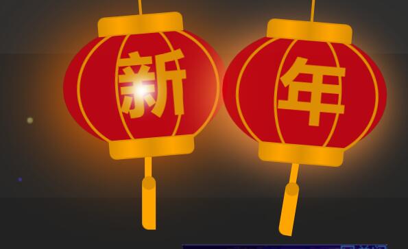
<!-- 灯笼效果 -->
<div class="deng-box2">
<div class="deng">
<div class="xian"></div>
<div class="deng-a">
<div class="deng-b">
<div class="deng-t">年</div>
</div>
</div>
<div class="shui shui-a">
<div class="shui-c"></div>
<div class="shui-b"></div>
</div>
</div>
</div>
<div class="deng-box3">
<div class="deng">
<div class="xian"></div>
<div class="deng-a">
<div class="deng-b">
<div class="deng-t">新</div>
</div>
</div>
<div class="shui shui-a">
<div class="shui-c"></div>
<div class="shui-b"></div>
</div>
</div>
</div>
<div class="deng-box1">
<div class="deng">
<div class="xian"></div>
<div class="deng-a">
<div class="deng-b">
<div class="deng-t">乐</div>
</div>
</div>
<div class="shui shui-a">
<div class="shui-c"></div>
<div class="shui-b"></div>
</div>
</div>
</div>
<div class="deng-box">
<div class="deng">
<div class="xian"></div>
<div class="deng-a">
<div class="deng-b">
<div class="deng-t">快</div>
</div>
</div>
<div class="shui shui-a">
<div class="shui-c"></div>
<div class="shui-b"></div>
</div>
</div>
</div>
<style>
/* 灯笼 */
.deng-box {
position: fixed;
/*top: -40px; */
top: 0px;
right: 150px;
z-index: 9999;
pointer-events: none;
}
.deng-box1 {
position: fixed;
top: 0px;
right: 10px;
z-index: 9999;
pointer-events: none
}
.deng-box2 {
position: fixed;
top: 0px;
left: 150px;
z-index: 9999;
pointer-events: none
}
.deng-box3 {
position: fixed;
top: 0px;
left: 10px;
z-index: 9999;
pointer-events: none
}
.deng-box1 .deng, .deng-box3 .deng {
position: relative;
width: 120px;
height: 90px;
margin: 50px;
background: #d8000f;
background: rgba(216, 0, 15, .8);
border-radius: 50% 50%;
-webkit-transform-origin: 50% -100px;
-webkit-animation: swing 5s infinite ease-in-out;
box-shadow: -5px 5px 30px 4px #fc903d
}
.deng {
position: relative;
width: 120px;
height: 90px;
margin: 50px;
background: #d8000f;
background: rgba(216, 0, 15, .8);
border-radius: 50% 50%;
-webkit-transform-origin: 50% -100px;
-webkit-animation: swing 3s infinite ease-in-out;
box-shadow: -5px 5px 50px 4px #fa6c00
}
.deng-a {
width: 100px;
height: 90px;
background: #d8000f;
background: rgba(216, 0, 15, .1);
margin: 12px 8px 8px 8px;
border-radius: 50% 50%;
border: 2px solid #dc8f03
}
.deng-b {
width: 45px;
height: 90px;
background: #d8000f;
background: rgba(216, 0, 15, .1);
margin: -4px 8px 8px 26px;
border-radius: 50% 50%;
border: 2px solid #dc8f03
}
.xian {
position: absolute;
/*top: -20px;*/
top: -50px;
left: 60px;
width: 2px;
/*height: 20px;*/
height: 50px;
background: #dc8f03
}
.shui-a {
position: relative;
width: 5px;
height: 20px;
margin: -5px 0 0 59px;
-webkit-animation: swing 4s infinite ease-in-out;
-webkit-transform-origin: 50% -45px;
background: orange;
border-radius: 0 0 5px 5px
}
.shui-b {
position: absolute;
top: 14px;
left: -2px;
width: 10px;
height: 10px;
background: #dc8f03;
border-radius: 50%
}
.shui-c {
position: absolute;
top: 18px;
left: -2px;
width: 10px;
height: 35px;
background: orange;
border-radius: 0 0 0 5px
}
.deng:before {
position: absolute;
top: -7px;
left: 29px;
height: 12px;
width: 60px;
content:" ";
display: block;
z-index: 999;
border-radius: 5px 5px 0 0;
border: solid 1px #dc8f03;
background: orange;
background: linear-gradient(to right, #dc8f03, orange, #dc8f03, orange, #dc8f03)
}
.deng:after {
position: absolute;
bottom: -7px;
left: 10px;
height: 12px;
width: 60px;
content:" ";
display: block;
margin-left: 20px;
border-radius: 0 0 5px 5px;
border: solid 1px #dc8f03;
background: orange;
background: linear-gradient(to right, #dc8f03, orange, #dc8f03, orange, #dc8f03)
}
.deng-t {
font-family: 黑体, Arial, Lucida Grande, Tahoma, sans-serif;
font-size: 3.2rem;
color: #dc8f03;
font-weight: 700;
line-height: 85px;
text-align: center
}
.night .deng-box, .night .deng-box1, .night .deng-t {
background: 0 0!important
}
@-moz-keyframes swing {
0% {
-moz-transform: rotate(-10deg)
}
50% {
-moz-transform: rotate(10deg)
}
100% {
-moz-transform: rotate(-10deg)
}
}
@-webkit-keyframes swing {
0% {
-webkit-transform: rotate(-10deg)
}
50% {
-webkit-transform: rotate(10deg)
}
100% {
-webkit-transform: rotate(-10deg)
}
}
</style>
<?php }
/** 将代码绑定到页脚 **/
add_action( 'wp_footer', 'deng', 100 );
二、打开当前主题页脚模板footer.php,在<?php wp\_footer(); ?>上面添加:
<?php require get_template_directory() . '/deng.php'; ?>
添加判断函数
如果只想在首页显示灯笼,可以用下面的判断语句把上面的代码包裹起来:
<?php if (is_home()) { ?>
<!-- 代码放这里 -->
<?php } ?>
手机移动端不显示:
<?php if (!wp_is_mobile()) { ?>
<?php require get_template_directory() . '/deng.php'; ?>
<?php } ?>
提示:加显示判断函数,代码必须添加在页脚模板<?php wp\_footer(); ?>函数上面,否则无效。
通过上面方法,发现头部导航页眉会遮住灯笼一部分,然后直接把以下代码放在主题header.php文件里就可以了:
<?php if (!wp_is_mobile()) { ?>
<!-- 灯笼效果 -->
<div class="deng-box2">
<div class="deng">
<div class="xian"></div>
<div class="deng-a">
<div class="deng-b">
<div class="deng-t">年</div>
</div>
</div>
<div class="shui shui-a">
<div class="shui-c"></div>
<div class="shui-b"></div>
</div>
</div>
</div>
<div class="deng-box3">
<div class="deng">
<div class="xian"></div>
<div class="deng-a">
<div class="deng-b">
<div class="deng-t">新</div>
</div>
</div>
<div class="shui shui-a">
<div class="shui-c"></div>
<div class="shui-b"></div>
</div>
</div>
</div>
<div class="deng-box1">
<div class="deng">
<div class="xian"></div>
<div class="deng-a">
<div class="deng-b">
<div class="deng-t">乐</div>
</div>
</div>
<div class="shui shui-a">
<div class="shui-c"></div>
<div class="shui-b"></div>
</div>
</div>
</div>
<div class="deng-box">
<div class="deng">
<div class="xian"></div>
<div class="deng-a">
<div class="deng-b">
<div class="deng-t">快</div>
</div>
</div>
<div class="shui shui-a">
<div class="shui-c"></div>
<div class="shui-b"></div>
</div>
</div>
</div>
<style>
/*  灯笼 */
.deng-box {
    position: fixed;
    /*top: -40px; */
    top: 0px;
    right: 150px;
    z-index: 9999;
    pointer-events: none;
}
.deng-box1 {
    position: fixed;
    top: 0px;
    right: 10px;
    z-index: 9999;
    pointer-events: none
}
.deng-box2 {
    position: fixed;
    top: 0px;
    left: 150px;
    z-index: 9999;
    pointer-events: none
}
.deng-box3 {
    position: fixed;
    top: 0px;
    left: 10px;
    z-index: 9999;
    pointer-events: none
}
.deng-box1 .deng, .deng-box3 .deng {
    position: relative;
    width: 120px;
    height: 90px;
    margin: 50px;
    background: #d8000f;
    background: rgba(216, 0, 15, .8);
    border-radius: 50% 50%;
    -webkit-transform-origin: 50% -100px;
    -webkit-animation: swing 5s infinite ease-in-out;
    box-shadow: -5px 5px 30px 4px #fc903d
}
.deng {
    position: relative;
    width: 120px;
    height: 90px;
    margin: 50px;
    background: #d8000f;
    background: rgba(216, 0, 15, .8);
    border-radius: 50% 50%;
    -webkit-transform-origin: 50% -100px;
    -webkit-animation: swing 3s infinite ease-in-out;
    box-shadow: -5px 5px 50px 4px #fa6c00
}
.deng-a {
    width: 100px;
    height: 90px;
    background: #d8000f;
    background: rgba(216, 0, 15, .1);
    margin: 12px 8px 8px 8px;
    border-radius: 50% 50%;
    border: 2px solid #dc8f03
}
.deng-b {
    width: 45px;
    height: 90px;
    background: #d8000f;
    background: rgba(216, 0, 15, .1);
    margin: -4px 8px 8px 26px;
    border-radius: 50% 50%;
    border: 2px solid #dc8f03
}
.xian {
    position: absolute;
    /*top: -20px;*/
    top: -50px;
    left: 60px;
    width: 2px;
    /*height: 20px;*/
    height: 50px;
    background: #dc8f03
}
.shui-a {
    position: relative;
    width: 5px;
    height: 20px;
    margin: -5px 0 0 59px;
    -webkit-animation: swing 4s infinite ease-in-out;
    -webkit-transform-origin: 50% -45px;
    background: orange;
    border-radius: 0 0 5px 5px
}
.shui-b {
    position: absolute;
    top: 14px;
    left: -2px;
    width: 10px;
    height: 10px;
    background: #dc8f03;
    border-radius: 50%
}
.shui-c {
    position: absolute;
    top: 18px;
    left: -2px;
    width: 10px;
    height: 35px;
    background: orange;
    border-radius: 0 0 0 5px
}
.deng:before {
    position: absolute;
    top: -7px;
    left: 29px;
    height: 12px;
    width: 60px;
    content:" ";
    display: block;
    z-index: 999;
    border-radius: 5px 5px 0 0;
    border: solid 1px #dc8f03;
    background: orange;
    background: linear-gradient(to right, #dc8f03, orange, #dc8f03, orange, #dc8f03)
}
.deng:after {
    position: absolute;
    bottom: -7px;
    left: 10px;
    height: 12px;
    width: 60px;
    content:" ";
    display: block;
    margin-left: 20px;
    border-radius: 0 0 5px 5px;
    border: solid 1px #dc8f03;
    background: orange;
    background: linear-gradient(to right, #dc8f03, orange, #dc8f03, orange, #dc8f03)
}
.deng-t {
    font-family: 黑体, Arial, Lucida Grande, Tahoma, sans-serif;
    font-size: 3.2rem;
    color: #dc8f03;
    font-weight: 700;
    line-height: 85px;
    text-align: center
}
.night .deng-box, .night .deng-box1, .night .deng-t {
    background: 0 0!important
}
@-moz-keyframes swing {
    0% {
        -moz-transform: rotate(-10deg)
    }
    50% {
        -moz-transform: rotate(10deg)
    }
    100% {
        -moz-transform: rotate(-10deg)
    }
}
@-webkit-keyframes swing {
    0% {
        -webkit-transform: rotate(-10deg)
    }
    50% {
        -webkit-transform: rotate(10deg)
    }
    100% {
        -webkit-transform: rotate(-10deg)
    }
}
</style>
<?php } ?>
上面代码加了手机端不显示灯笼特效的代码的,想在手机端显示就删除以下代码:
<?php if (!wp_is_mobile()) { ?>

<?php } ?>
至此,网站加灯笼特效完美显示!


